Hello!
I'm Robert
I Love UX
Hello!
I'm Robert
I Love UX
Nice to meet you!
I haven’t met you yet, but I can only assume you’re a fantastic person. I’ve put this portfolio together to highlight three of my more recent projects, and some of what I did in each role for you. To keep things easy to scan I’ve kept things short and to the point. So if you have any questions I’d be happy to answer them and walk you through my thinking and the context of my work.
I’m driven by my love for UX, my passion for XR, and my belief in technology to make the world a better place. For my entire work history check out my LinkedIn.
Oct 2021 – Oct 2023
Job / Medical Extended Reality Specialist
Philips – Medical Device
• First Medical Extended Reality (MXR) Specialist hired by Philips globally
• Product Manager responsible for XR product planning and deployment
• Lead design and implementation of XR product visual language and UX
• Independent project management of concurrent development projects
• Instructed global teams inside Philips on how to navigate the XR space
• Applied XR platforms to healthcare training and enablement
2021 – 2023
Project / Medical VR Training
Project Management / UX Design & Research
Project Background
The healthcare industry is confronting a major challenge. The number of surgeons that provide care increases at a fixed-liner rate. The number of patients however increases at an exponential rate. Further, patients are living longer and requiring more and more complex care. There is no single solution to this problem, one element I work on however is training.
The Problem
Training of surgeons is expensive and lacks the ability to easily scale. The current state of the art is 1:1 mentorship. It is somewhat akin to watching someone work on a car, seeing a slide show on how to do it, and then doing it yourself. Current training methods additionally can’t recreate emergencies very well. A cadaver or dummy is unlikely to have a convincing emergency event.
My Role
My work at Philips is to build an ecosystem and technology platform to support VR training. The details of my work remain covered under my NDA but I act primarily as a Product Manager. Drawing from both my technical background and my UX background I work to develop product roadmaps and manage development. I work with both internal and external global teams and stakeholders to build a constellation of products to help push beyond the cutting-edge of medical training into the future.
My Impact
• Led the development of VR/AR Surgical Trainers
• Created product specifications based on user research in the field
• Led internal 3D/CAD asset pipeline restructuring
• Managed relationships with OEMs and vendors in the XR space
2022
Project / AR Healthcare Concepts
UX Design / Motion Design
Project Background
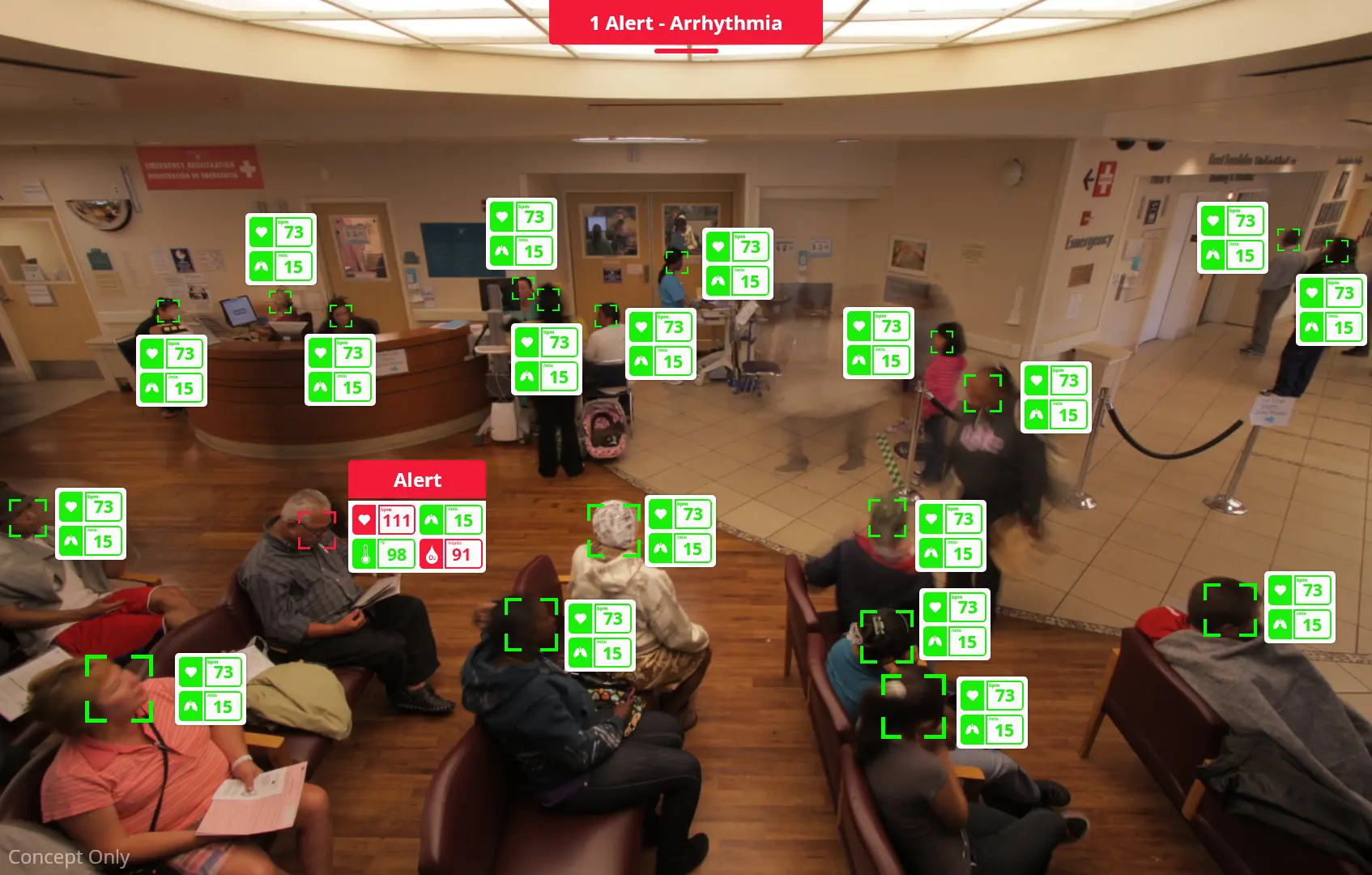
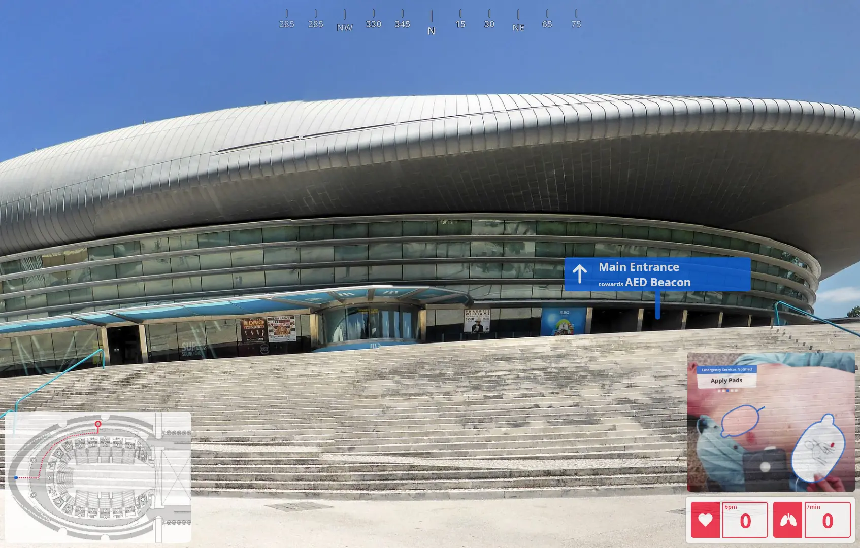
You need to define where you are heading if you ever want to reach it. This work was part of a high-level effort within Philips to help define what XR in healthcare might look like within the Philips product stack.
My Role
For this Project, I worked closely with our Chief Medical Officer, Global Director of Communications, and their teams. During the script ideation process, I drew on both my own experiences and ideas as well as the Philips product stack to suggest two ideas. These ideas were then tweaked and refined within the working group. Once the ideas achieve early consensus I created mock-ups, storyboards, and scripts. With approval from the wider team, I delivered the final videos with the support of external agencies. From the first email to the final deliverable this work was completed in just under a month. It was shown on stage at Web Summit 2022.
My Impact
• Created the vision for what AR/MR can be in the future of healthcare
• Created wireframes and visual style based on user/field research
• Delivered concept videos in a cooperative environment under a short timeline
• Supported global clinical and communications teams in their work
Stakeholder Input
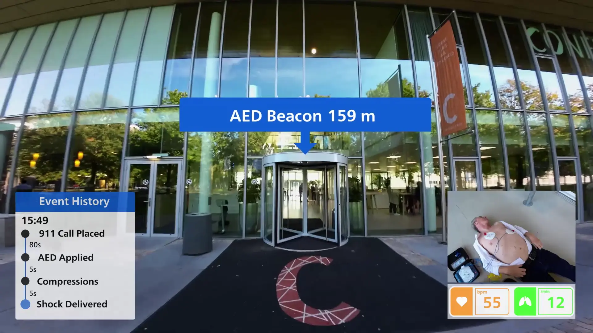
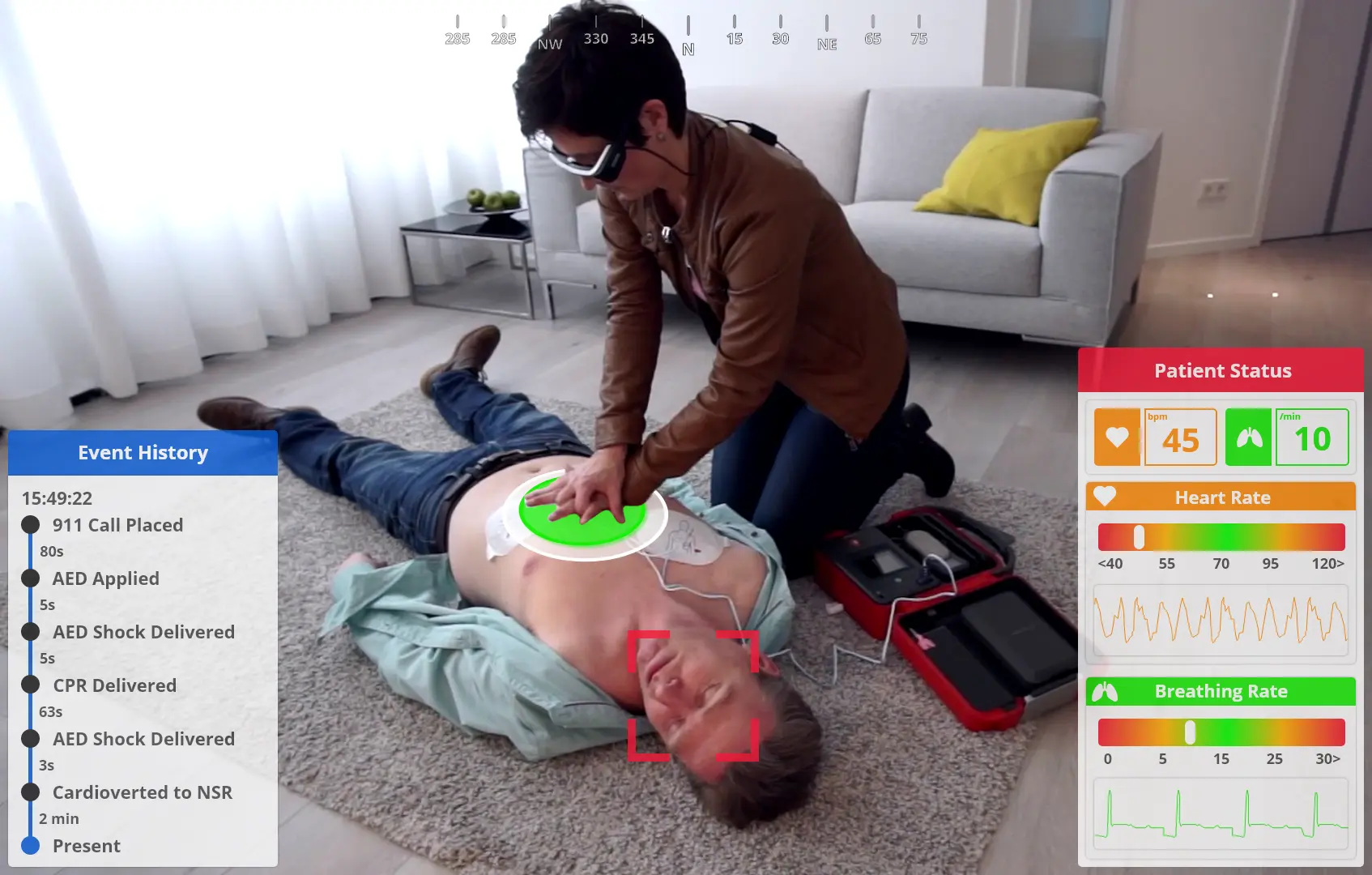
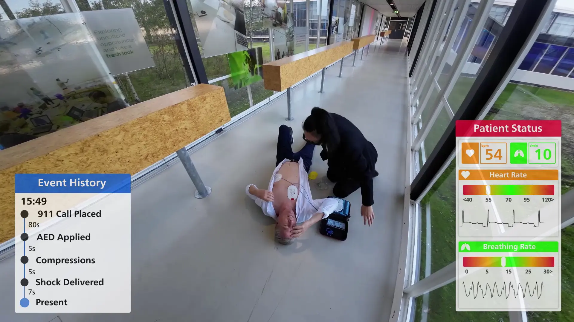
I gathered input from both potential AED users and first responders for this concept. Their input helped refine the ideal feature sets shown and the information each users is presented with. First responder users were given an event history UI that was created with a stakeholder. AED users had their UI’s slimmed down to reduce cognitive load during a stressful situation.
Full Video
I worked with a team on this project and you can see their work and excellence on full display throughout the presentation. You can see my work from 0:00 to 4:21 and from 13:53 to 16:02.
May 2020 – Oct 2021
Job / Senior Engineer, UI/UX Developer
Stryker – Medical Device
• Solely responsible for UX of CT scanner and spinal surgery robot platform
• Identified user needs based on field/lab research and stakeholder input
• Production of high and low-fidelity wireframes using Adobe XD
• Performed lab and field research to assess new and existing products
• Collaborated in global efforts to update design system and guidance
• Responsible for FDA 510k usability product testing and compliance
2020 – 2021
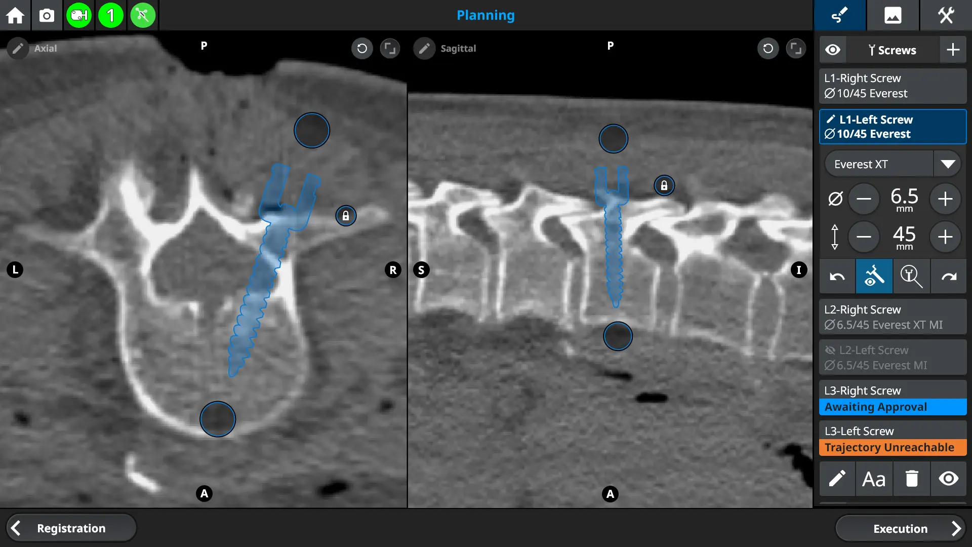
Project / Spine Surgery Robot
UX Design / User Research
Project Background
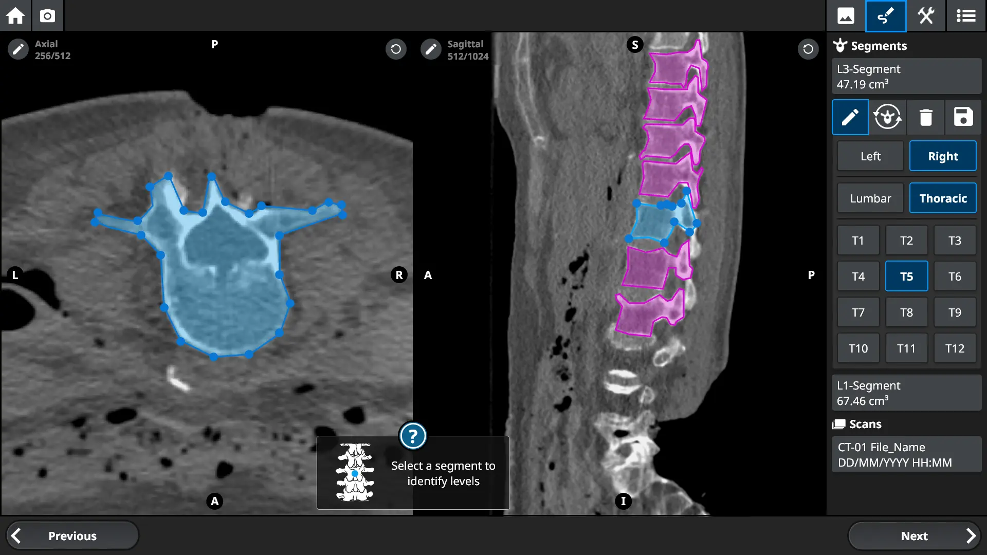
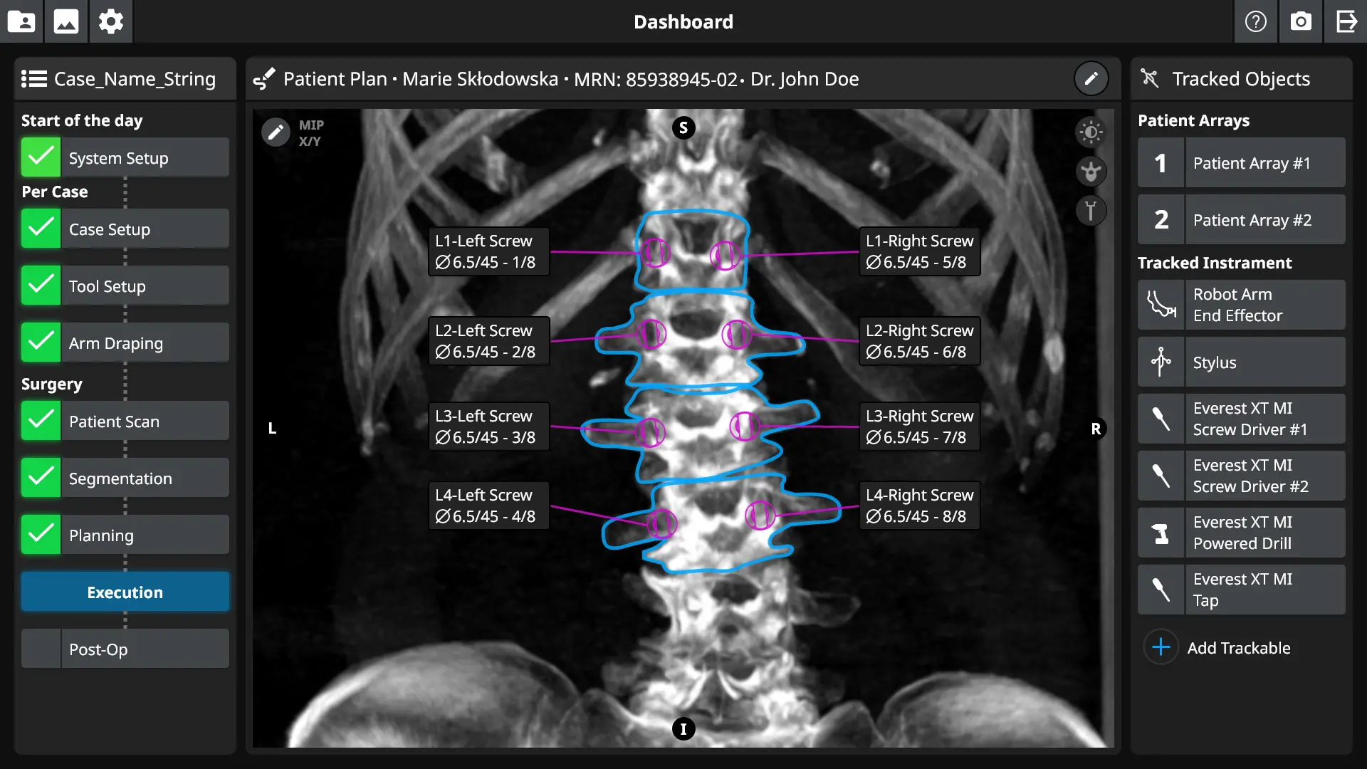
A spinal surgery robot is not a single thing, it is a system of different interwoven hardware and software elements working together. Such a system must work inside an operating room which is itself a system of different interlinked systems all to support the patient. You need to place a screw inside the spinal column with sub-millimeter accuracy while the patient is breathing and their spine is moving. Any gaps in understanding between the users and the system could have life-altering impacts. If an emergency does occur humans and machines must work flawlessly in concert to provide time-sensitive care. There isn’t a lot of room to be wrong.
My Role
They asked me during my interview if I had a strong stomach, I learned later on why that was important for a UX designer. The first thing I did when I joined the team is I went into the field and learned how spine surgery was done. I listened to users from surgeons to nurses so that I could model their needs and interactions through the course of a single case and between them.
I was solely responsible for the usability of the system and in many cases how the product was to work. As a bridge between users, engineering, marketing, and other stakeholders I helped the team to define a great product.
My Impact
• Created the entire UX flow from scratch including the entire UI
• Supported development teams implementing the UI I had created
• Cooperated with global UX team to align design across products and teams
• Led usability validation labs and conducted field research
• Brokered alignment between diverse sets of stakeholders on product vision
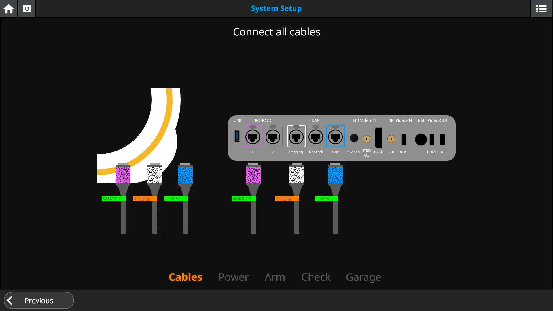
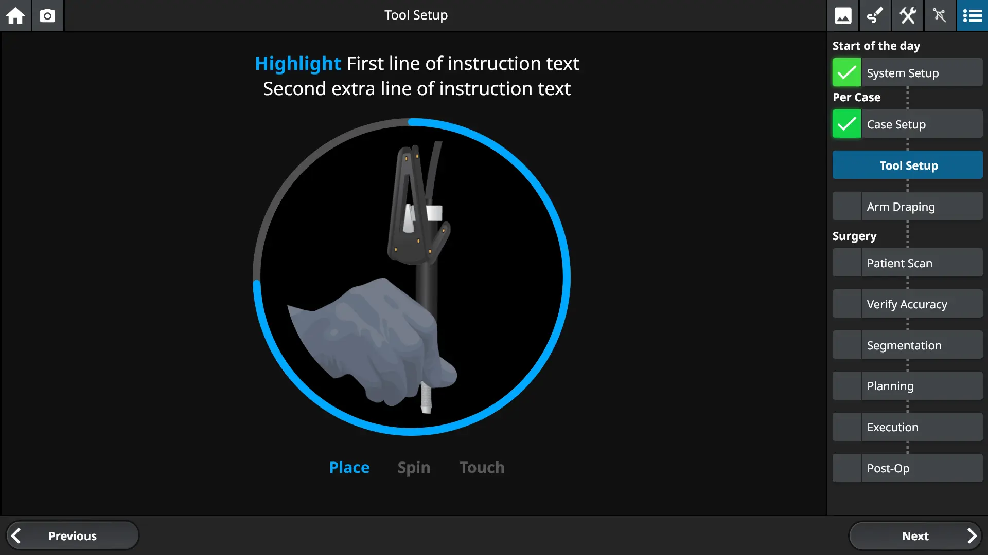
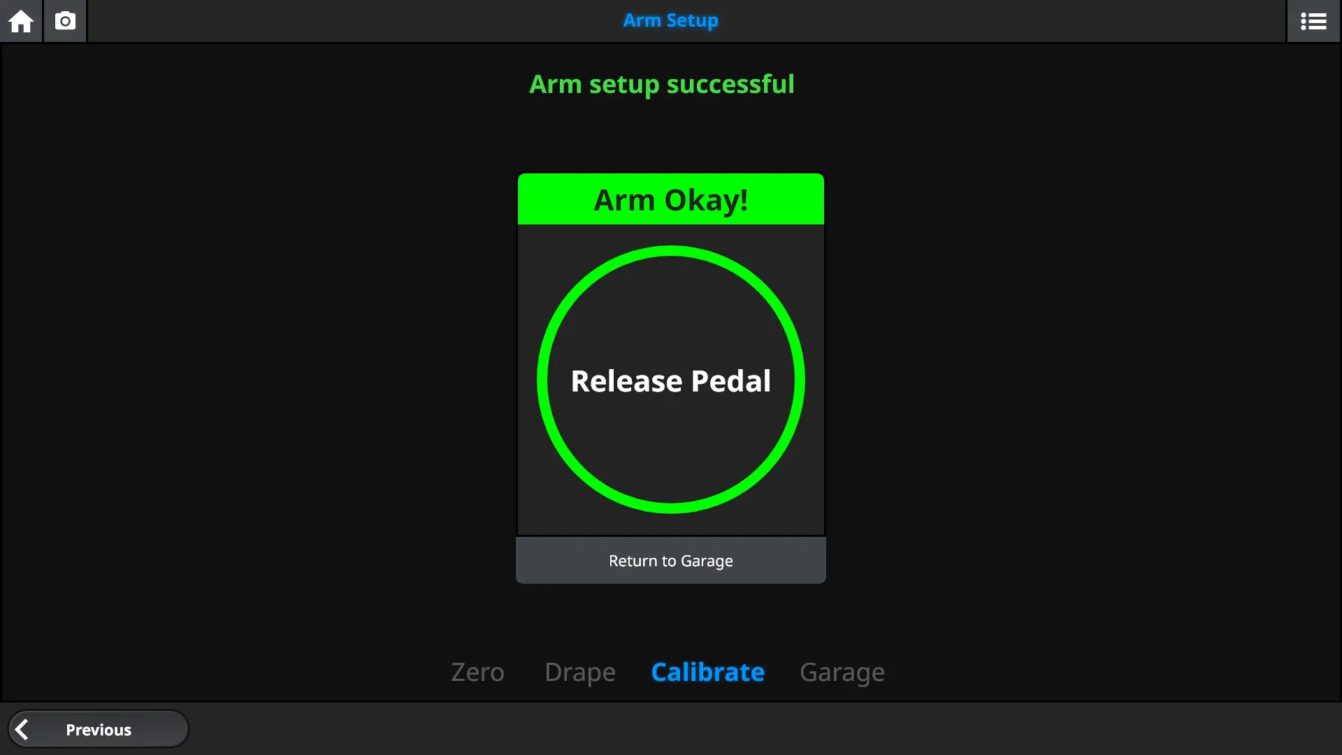
High Fidelity Mockups
Who I worked with
On the Spinal Surgery Robot project, I worked closely with upstream and downstream marketing, clinical representatives, compliance and regulatory teams, software and hardware engineering, project leadership, and end users to balance the needs of all stakeholders.
High Fidelity Mockups
Key Learnings
01 Your desk isn’t the real use environment
Although not the most exciting the choice of each color was driven by research. The product was designed for use in a sterile operating room. Screens are often draped in dim rooms with harsh spot lights creating strong glare and washed out colors. You would never realize the challenges your users face if you just sat at your desk. Field research is key to any successful UX design.
02 Surgery is a team sport
Surgery is not performed alone, it is performed by a team of experts performing a dizzying array of complex tasks back to back. To be successful you need to design for the whole team and for the whole game, not just a single player. This means integrating a diverse array of perspectives and use conditions
03 You aren’t always your target user
The distance between your team and your users can be a key determining factor in how decision-making can break down. No one on the design or engineering teams was a surgeon or had that experience, as a result, it was counter productive to make decisions that were not guided by data or direct and broadly supported user feedback.
Fun Fact
Modern surgical navigation systems use the same IR camera technology employed in motion capture systems used in entertainment.
2020 – 2021
Project / CT Scanner
UX Design / User Research
Project Background
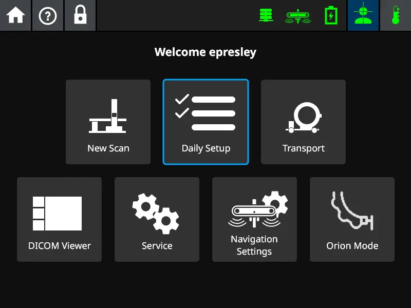
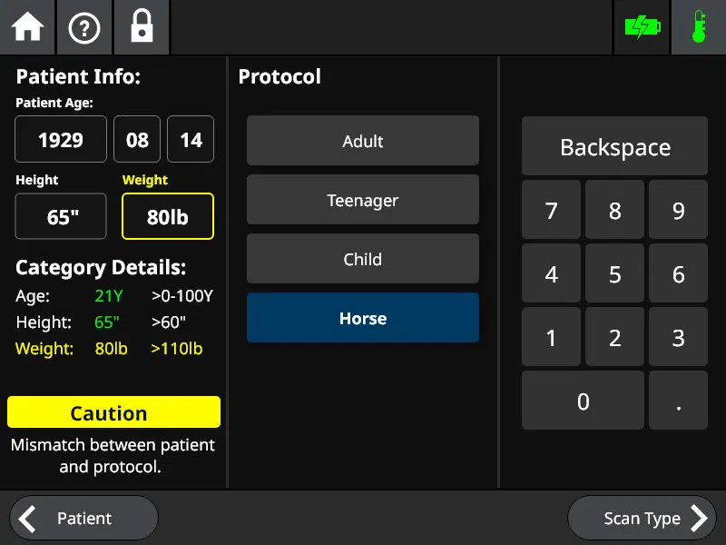
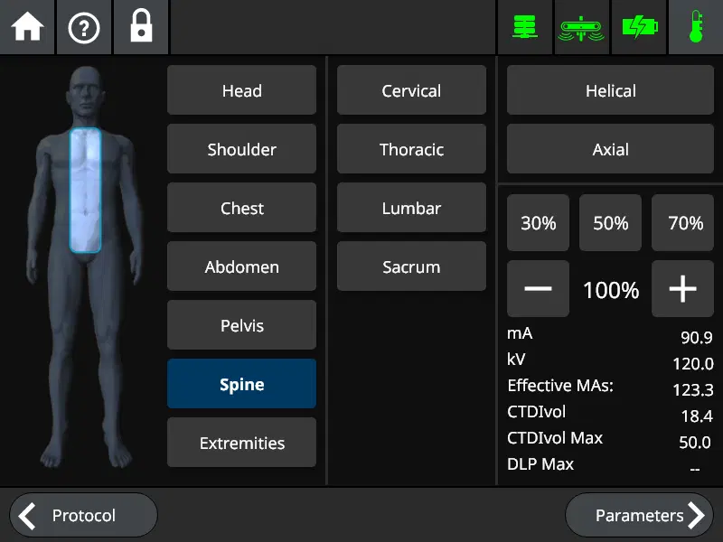
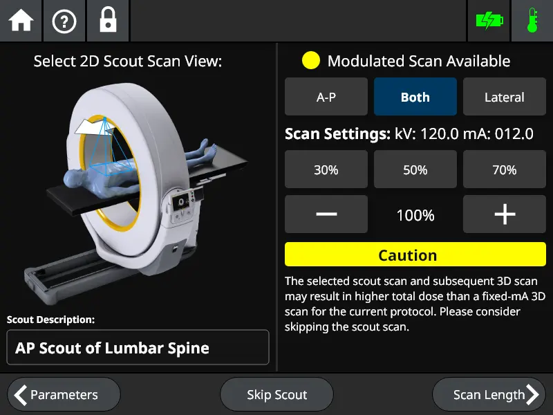
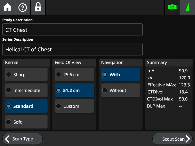
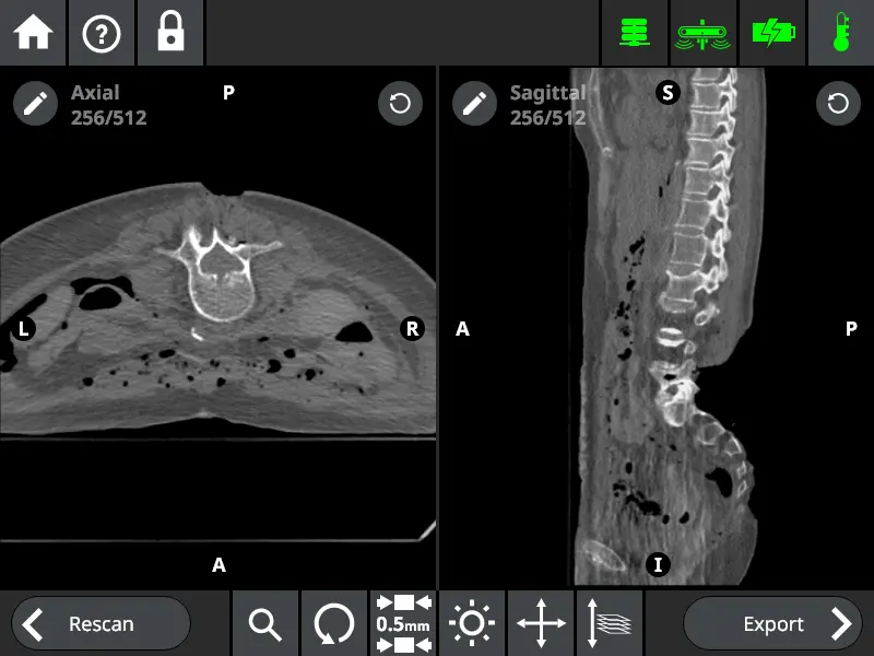
This CT scanner product was a mobile scanner for use inside the operating room. Its unique product feature was its ability to generate full 3D CT images inside a normal OR instead of a more specialized room. The product had been on the market for a number of years and was in use globally. The scanner was used to treat covid, spinal surgeries, and a variety of other adult and pediatric cases. It was an FDA 510k-cleared product that emitted radiation, any misunderstanding between the user and the system could be disastrous.
My Role
Prior to my joining the team there was no UX designer. No one was even sure who had designed the first UI, only that it no longer made much sense. My task was to re-examine the system and help polish it to a mirror finish. I was in charge of usability broadly which wasn’t just limited to what was on the 800 by 600px screen. I took a holistic view to bring order to chaos. I had to wear a heavy lead vest and radiation badges for user testing but I know a product I worked on is out there helping people.
My Impact
• Redesigned entire UI flow and updated visual design
• Significantly reduced time to complete most UI tasks
• Conducted in-depth lab and field research into product
• Worked with broad team to help define product roadmap
High Fidelity Mockups
Who I worked with
The input of a diverse array of stakeholders was key to ensuring any design met the needs of all users. This was a product that throughout its lifecycle was touched by a lot of different user groups. I worked with internal stakeholders such as software & hardware engineering, field maintenance, project management, marketing, and sales. I also worked closely with all target users including surgeons, medical physicists, and rad techs.
High Fidelity Mockups
Key Learnings
01 Test with your real users
Field survey and maintenance data indicated an odd pattern of damage to the system during transport. Lab and field research I conducted traced this to how the system was designed to be moved and the expected body type. Internal hardware engineering average height was 6’1” and majority male, field data indicated a predominately female nurse target user with highly variable heights and upper body strength.
02 If it isn’t attached it will get lost
During lab testing of emergency procedures with real users I uncovered skill gaps. This was traced back to the design expectation that users would always have access to their manuals. Survey data indicated that 0% of current users had easy access to their manuals. Only a small minority even knew where it was. When designing for the worst-case scenario don’t count on things going your way.
03 Idiot Proofing
One of the hard-won lessons the FDA tries to impart is when working to avoid an adverse event the first thing you should do is build a system that prevents it from occurring. The last thing you should try if everything else failed is to tell users what not to do inside a manual. My experience with this project taught me the value of this approach. The example I would use with engineers is box cutters. Modern ceramic box cutters never lose their edge but also aren’t sharp enough to cut skin. To make the best product possible you need to be innovative in your design.
Fun Fact
The system used CUDA acceleration for image reconstruction and systems were either equipped with an Nvidia Geforce 1080 or 2080ti GPU with an x86 intel CPU. It was possible to run Doom on the CT scanner.
I do things outside work too!
I work to give back
I believe XR will change the world one day, but I also think it isn’t quite there yet. We haven’t reached a home dial-up moment or the move from mainframes to personal computers quite yet. That’s why I love showing XR to new people and giving them a chance to interact with something that will define the future. Most recently I had the chance to speak to a small class of community college students about what the future holds and give them some hands-on time. At the start they were either asleep or on their phones, by the end they were bursting with questions and ideas.
and I keep active with photography
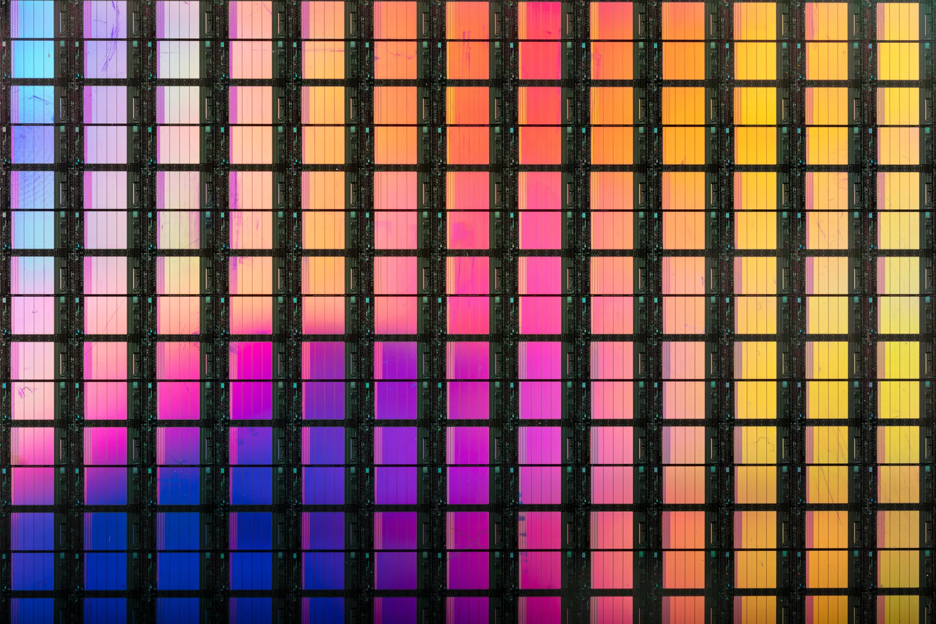
When I get the right subject I love shooting macro of off things that give off amazing color. When the right one comes up on eBay silicon wafers can produce some amazing color. When I’m shooting those however I go for panoramic photography. I enjoy the challenge and the result of trying to capture the entirety of a big scene like a mountaintop.
Let’s Chat
